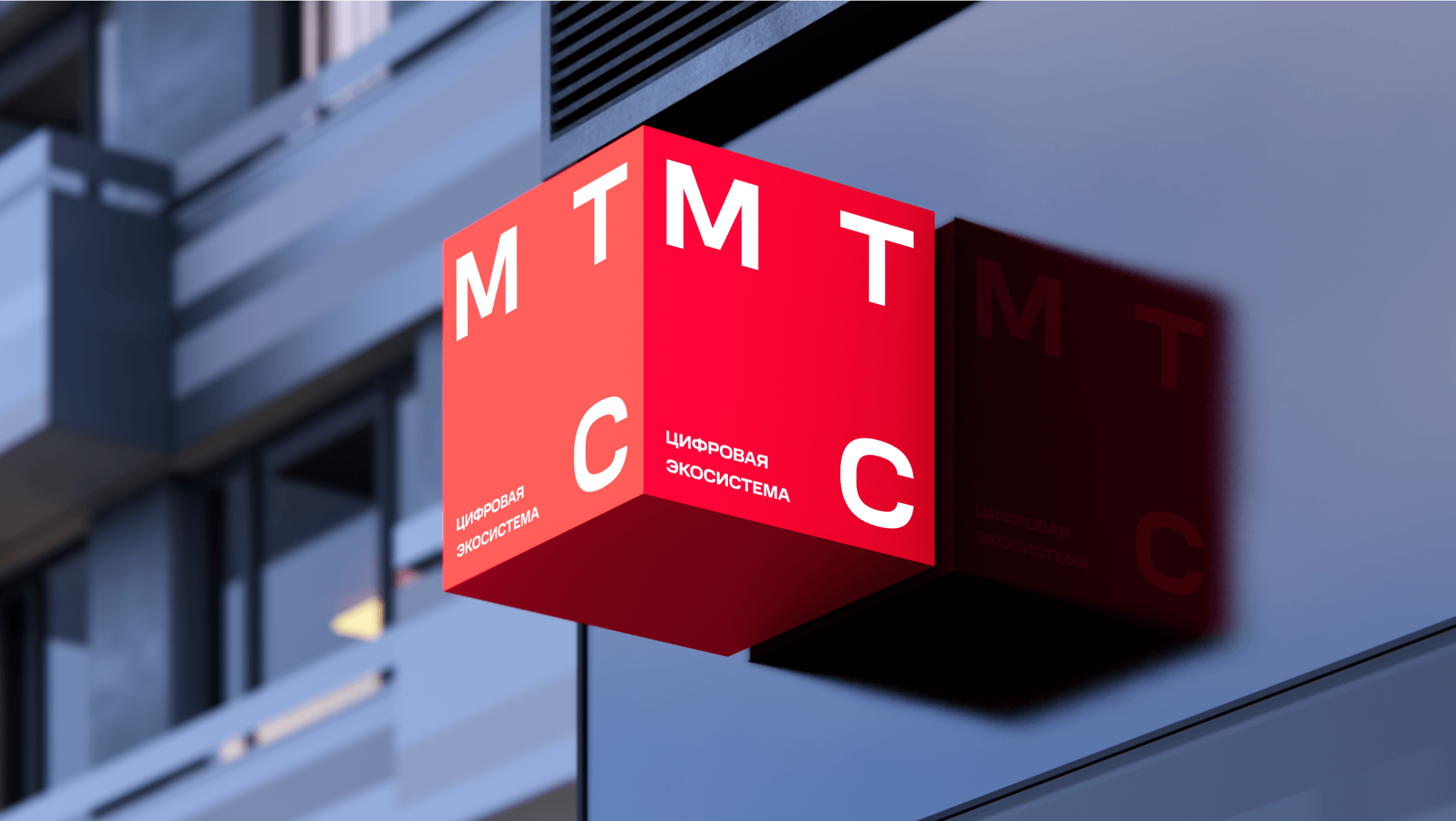
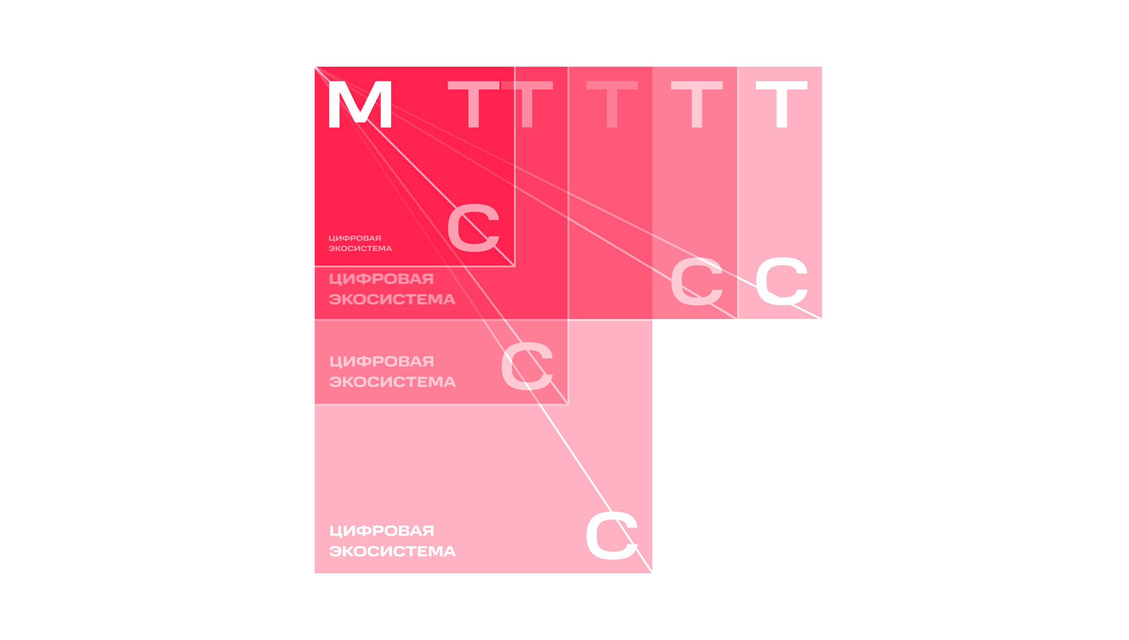
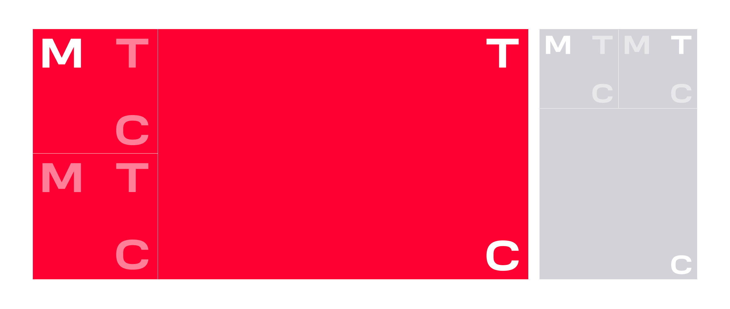
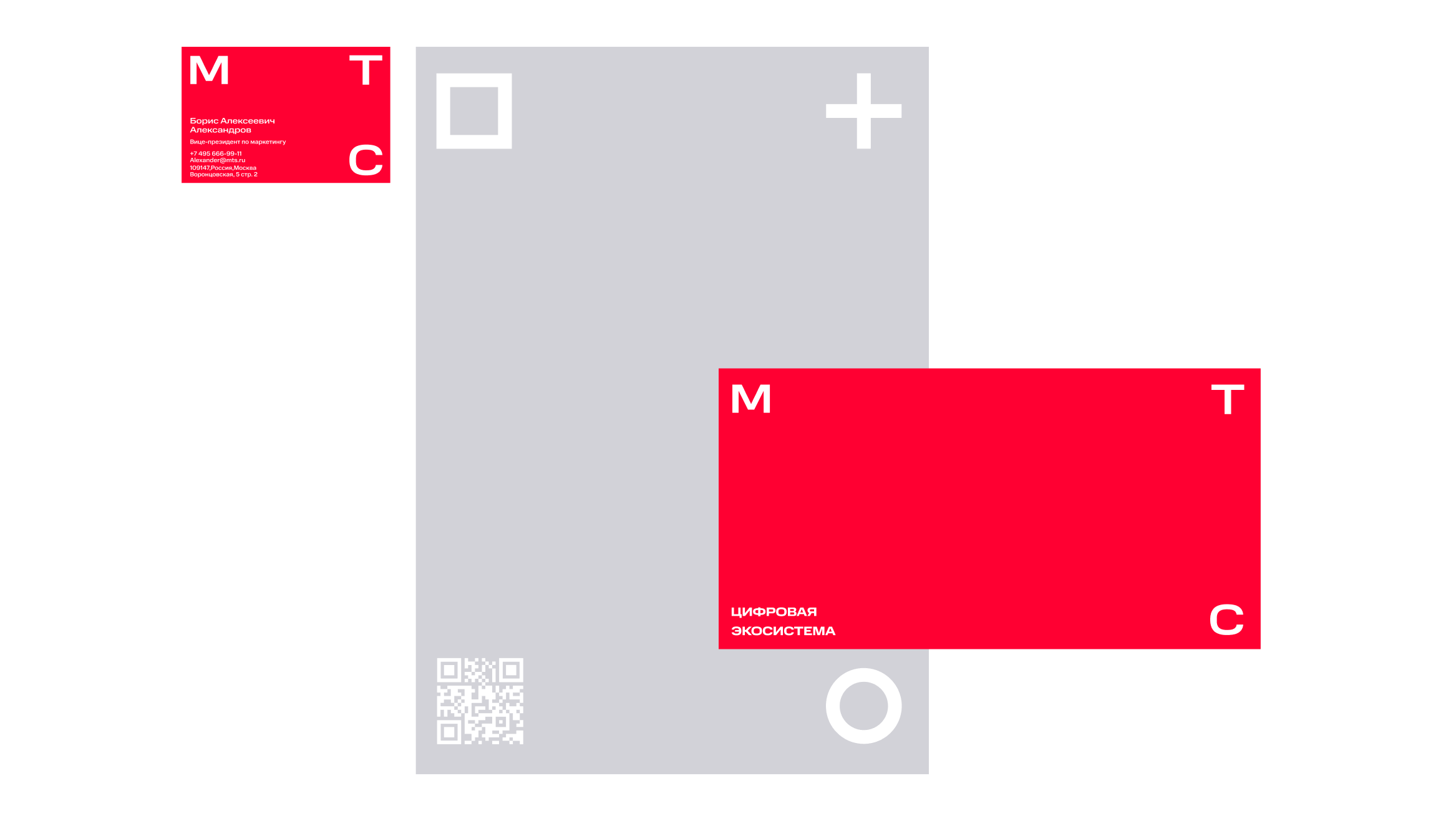
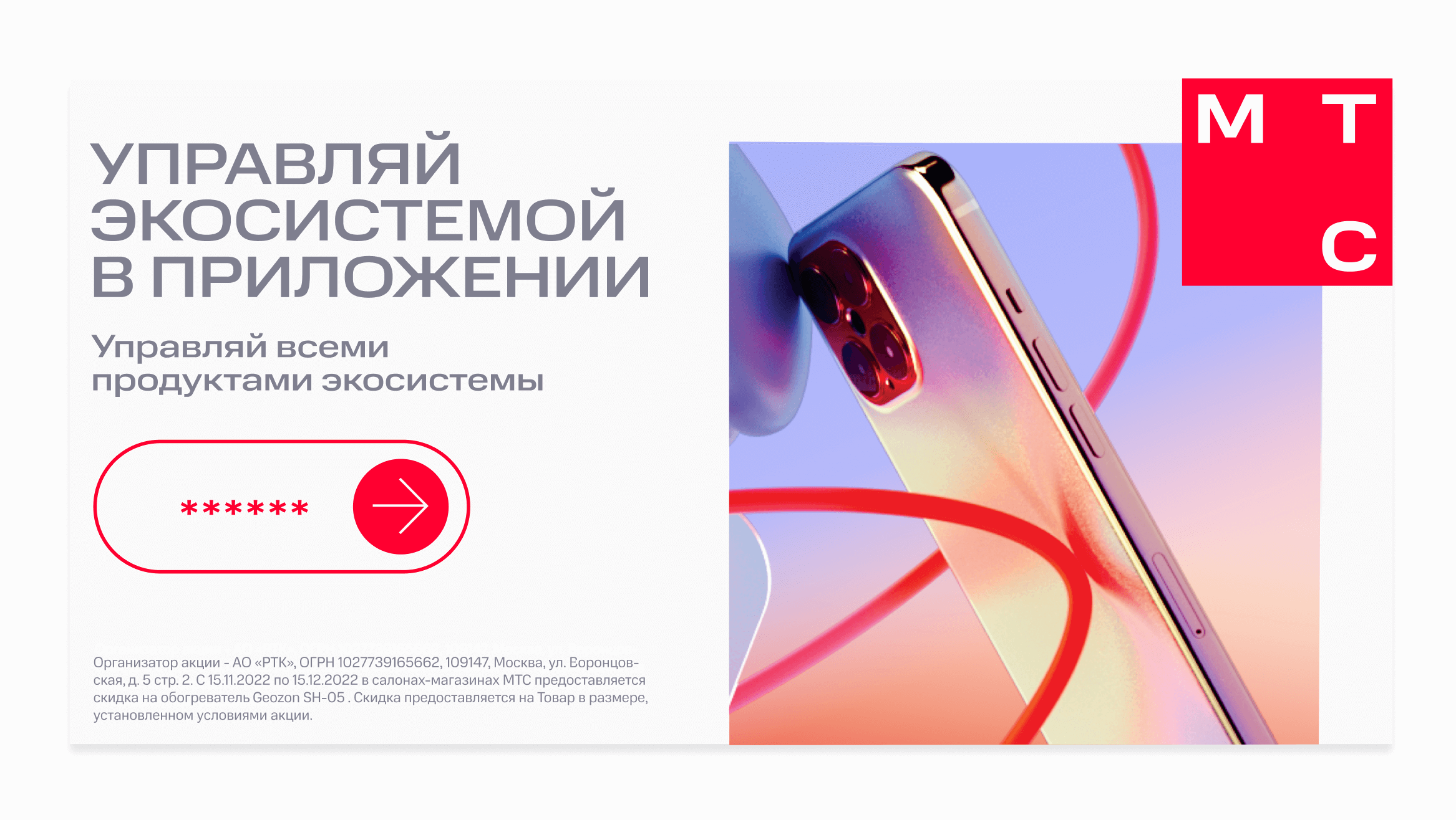
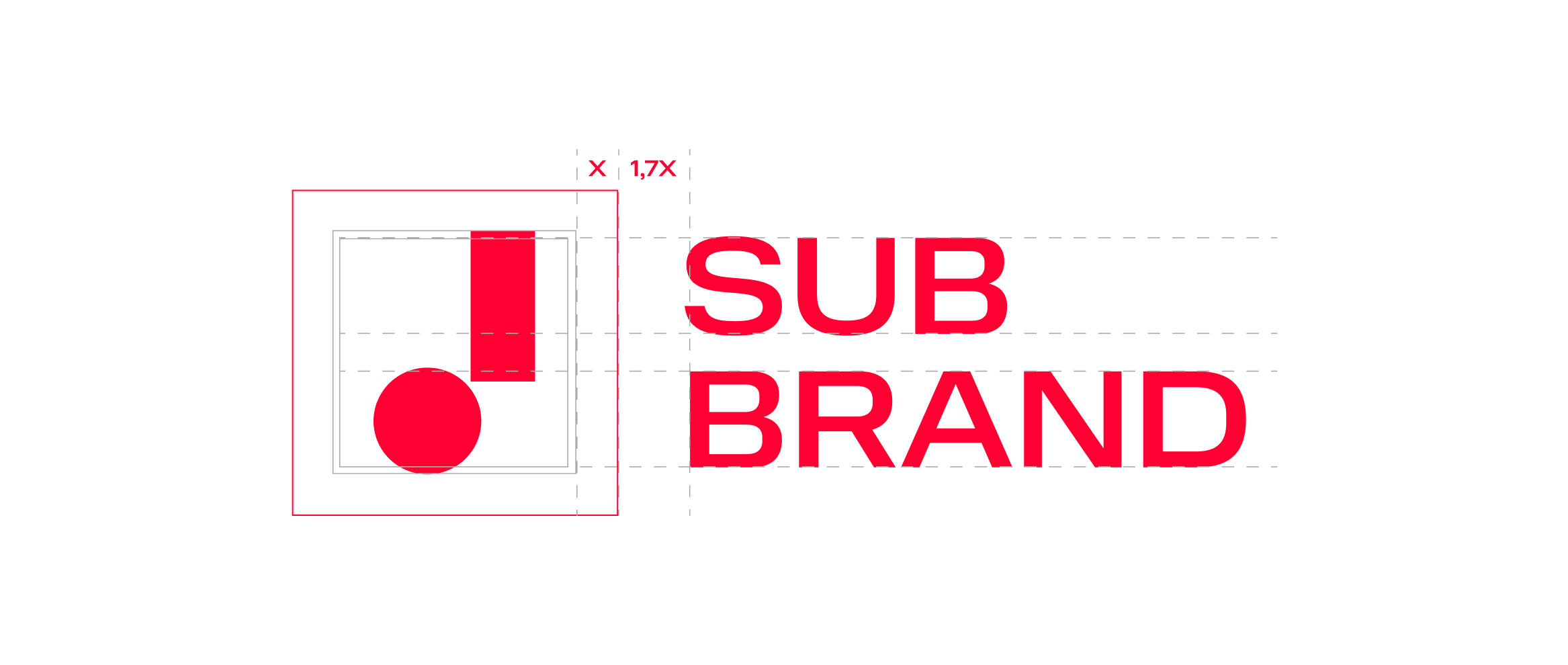
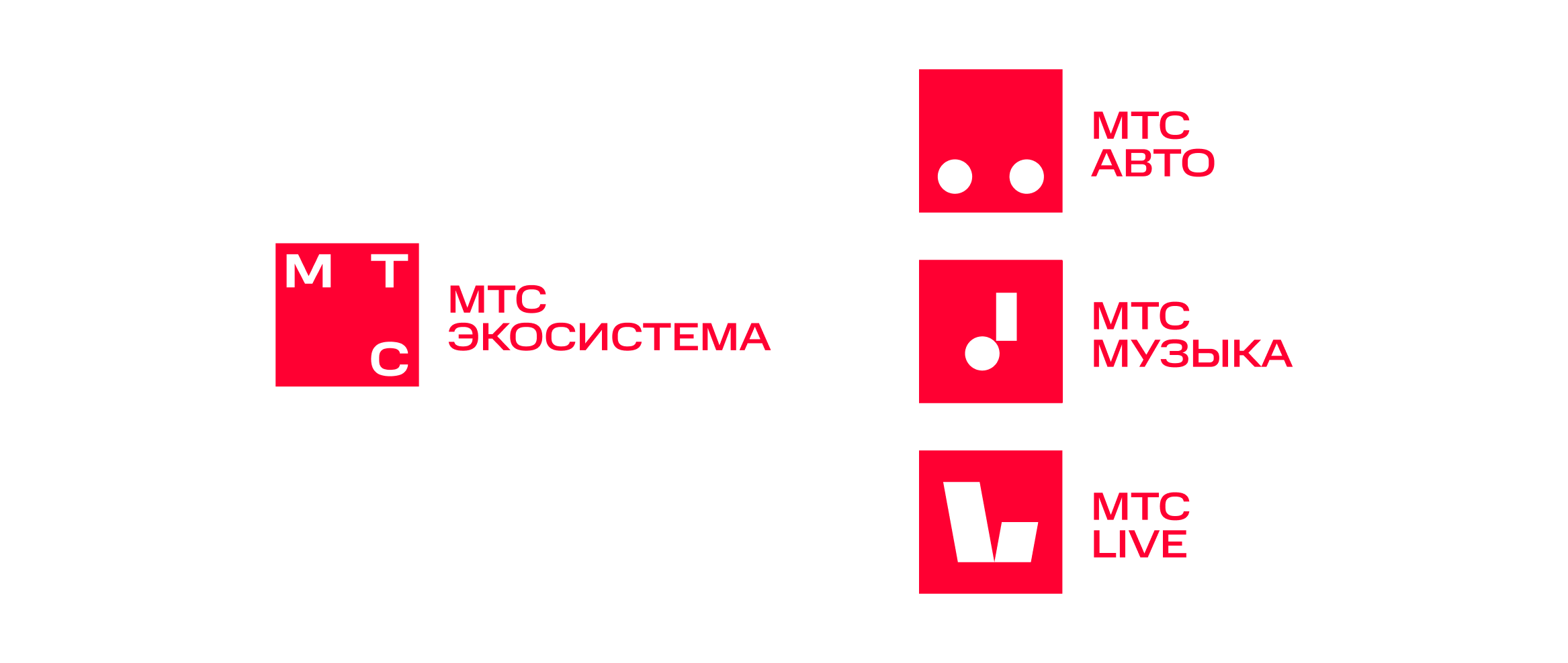
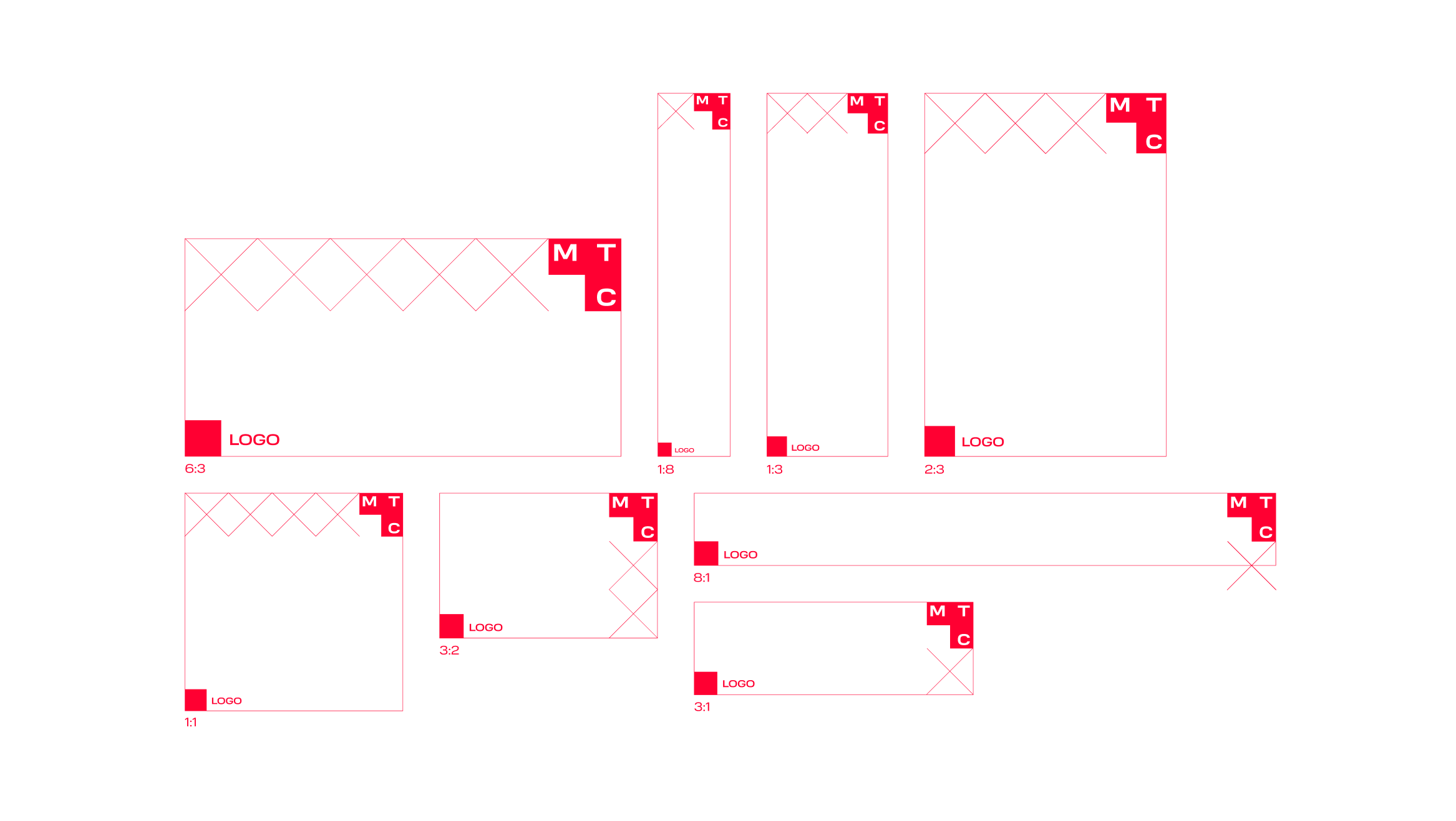
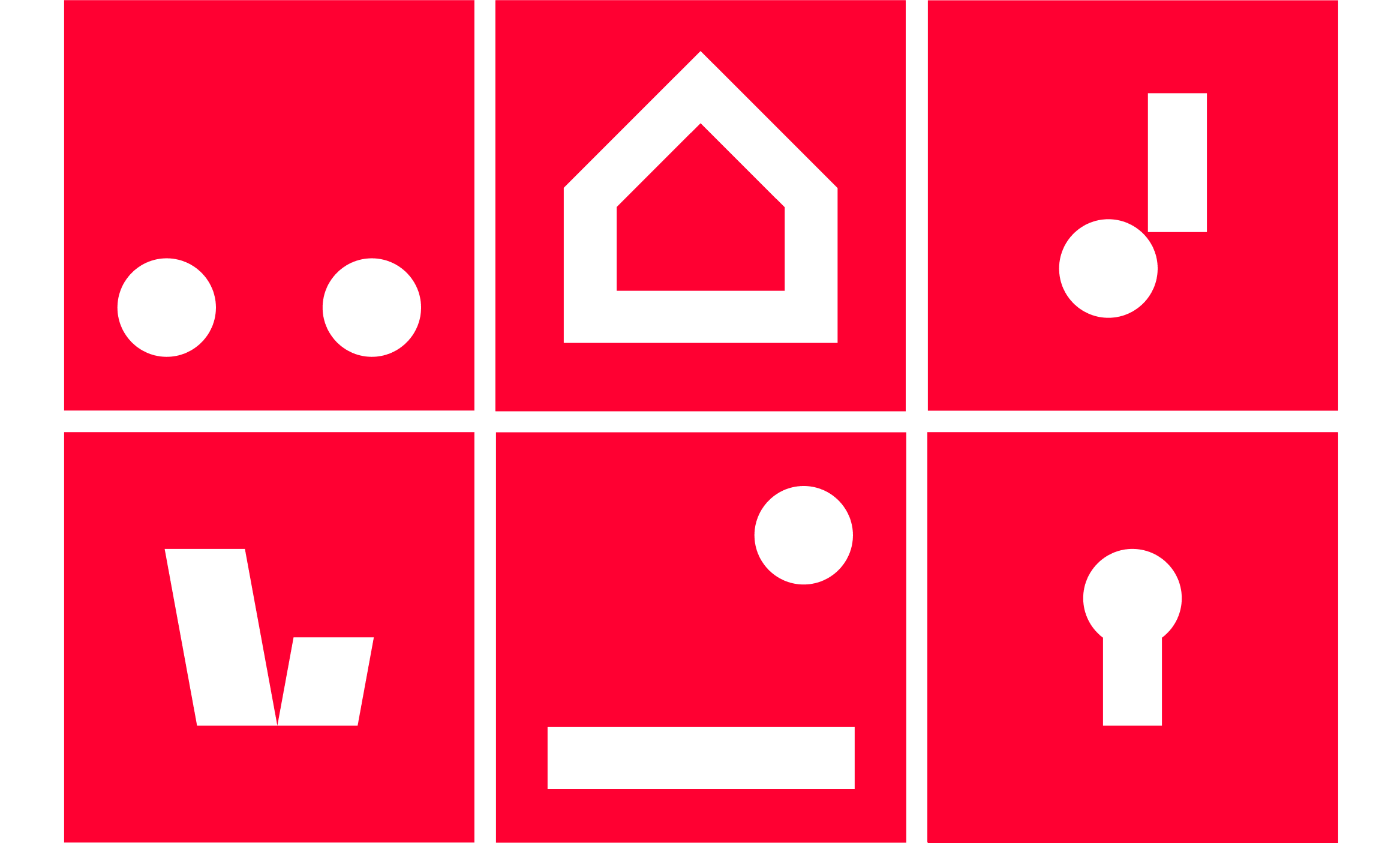
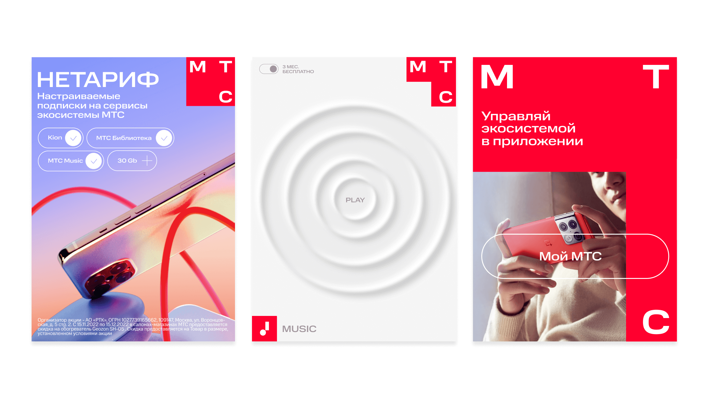
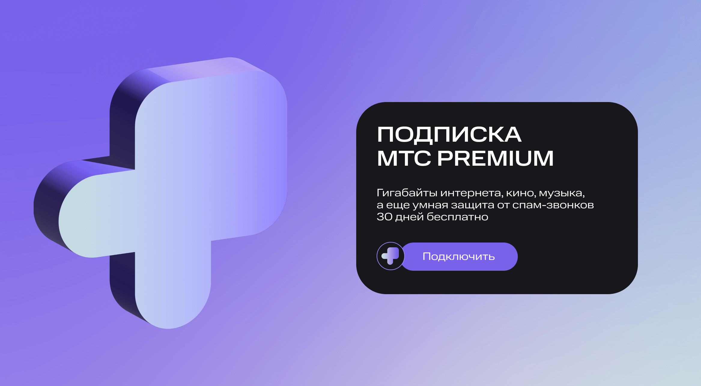
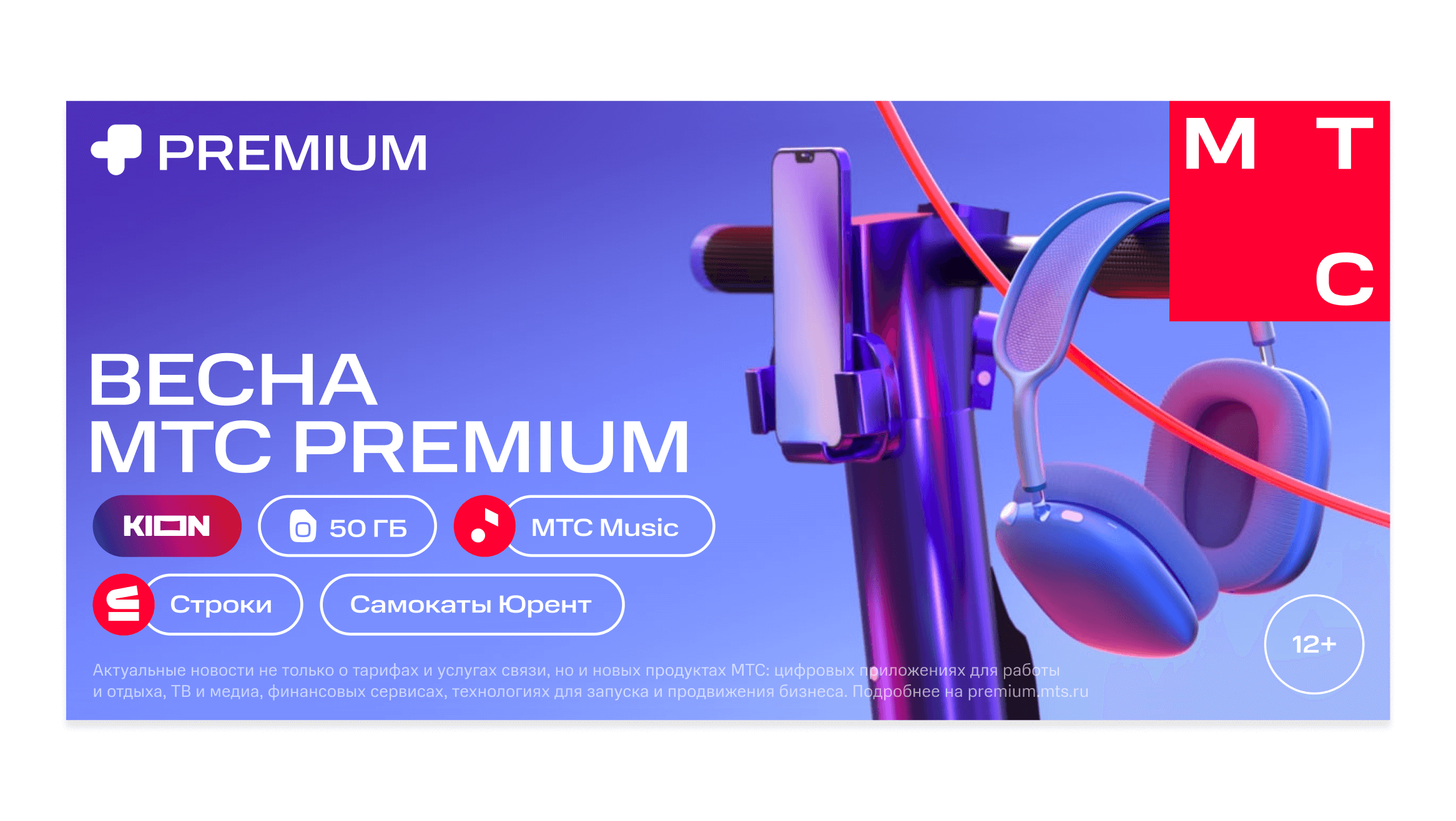
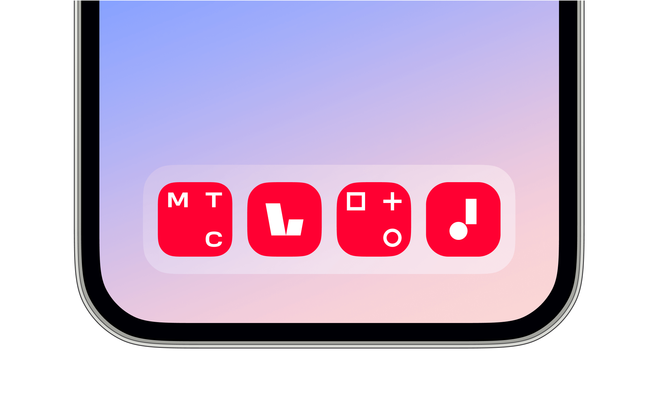
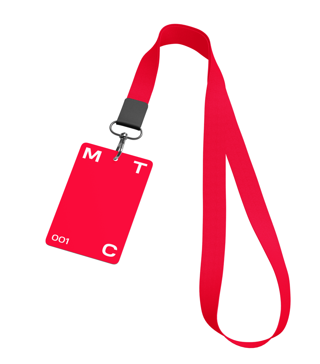
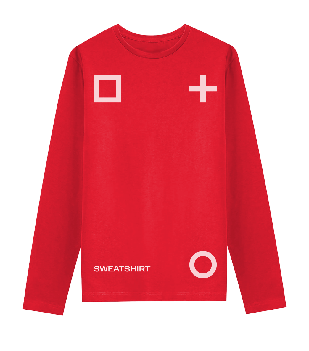
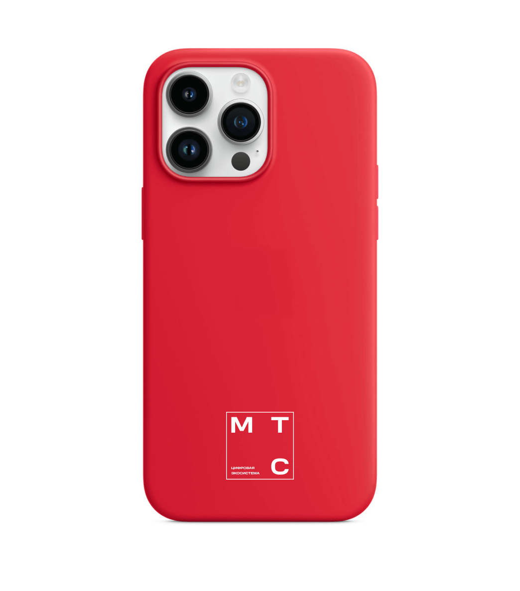
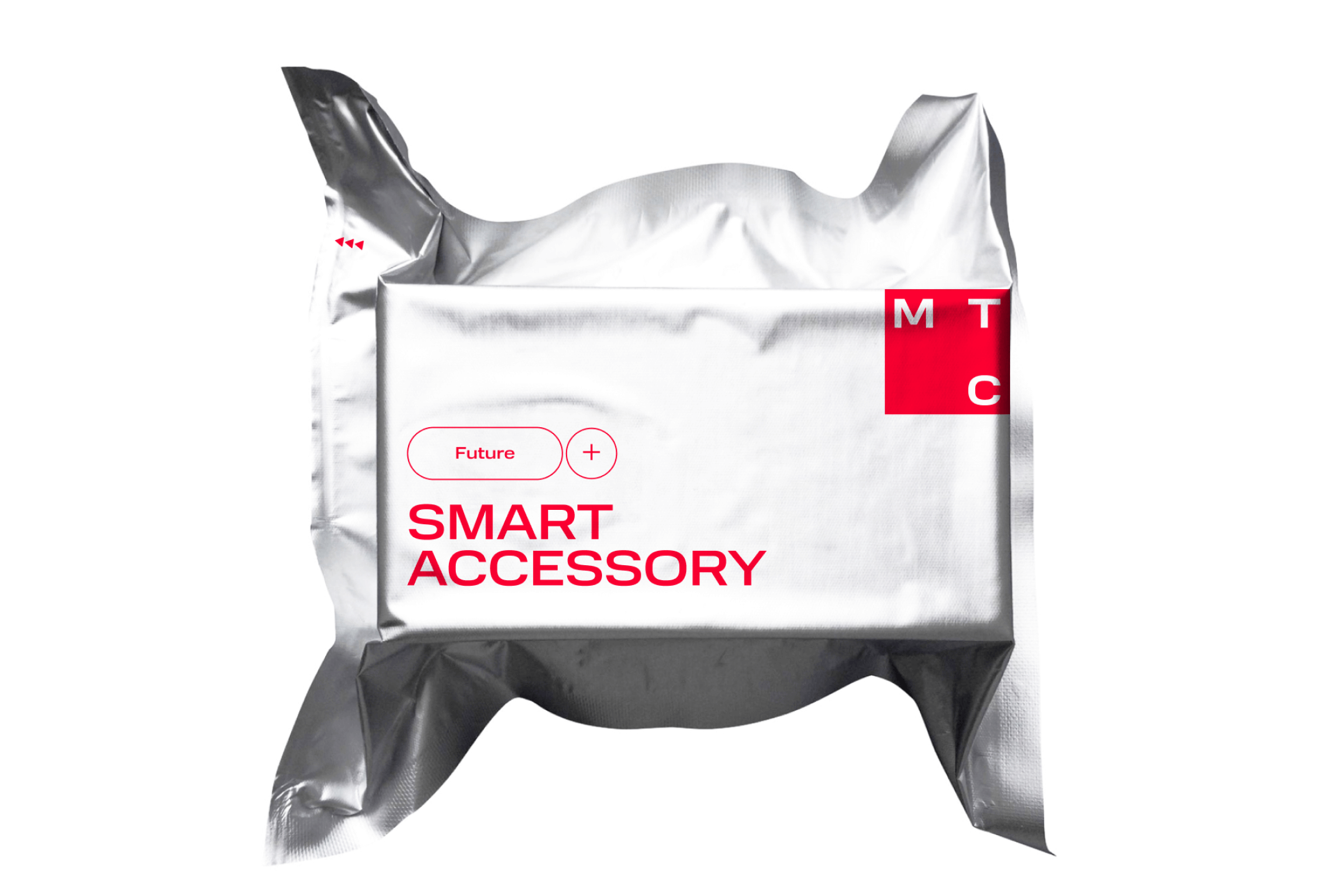
We came up with a new idea for the identity of an ecosystem of MTS digital services. It’s embodied in an adaptive logo within a stable square shape. With this solution, we devised a flexible design system to develop communications both for the ecosystem and for individual products and sub-brands.
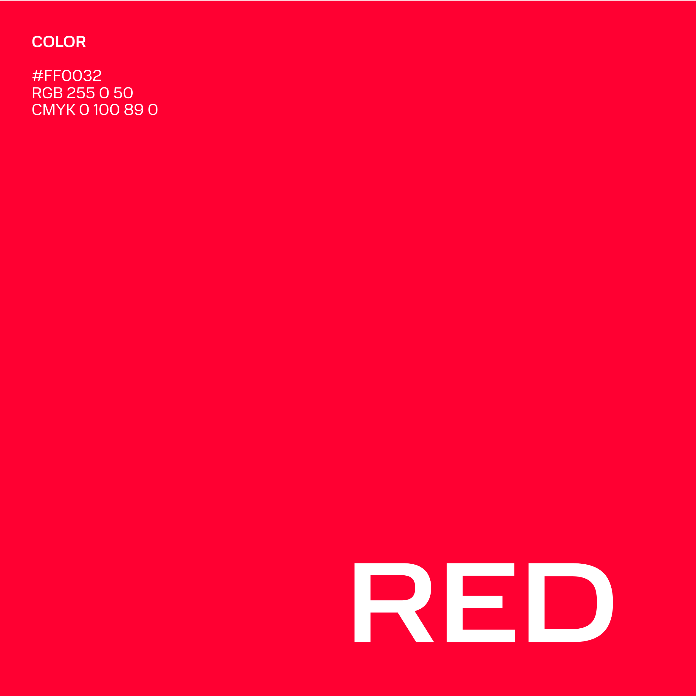
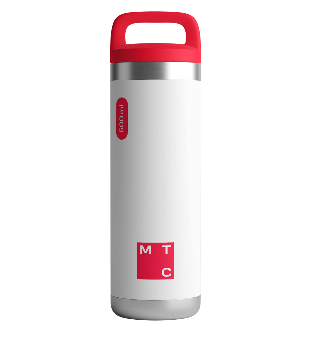
We kept the brand’s distinctive red colour — the colour of emotion and leadership — but made it more modern and digital. The new corporate font adds to the unity of visual communication.
Design
Brand Identity
Communication Design
Guidebook
Brandbook
Rebranding
Motion Design
Merch
МТС
About
Area
Design, Brand Identity, Communication Design, Guidebook, Brandbook, Rebranding, Motion Design, Merch
Client
MTS
Team
- Sergey Tsarkov
- Varvara Tsarkova
- Olga Kavun
- Irina Kulikova
- Vitaliy Worobiev
- Daria Yushketova
- Rita Akimova
- Alexandra Fedorina
- Daria Goryacheva
- Ekaterina Nikolaeva